Sony Ericsson launches a new redesigned web site
22 September 2009 by Olav Hellesø-Knutsen As far as I can see, only visual elements have changed. The navigation structure and content is the same. The usual green Sony Ericsson logo ball are replaced with one of 6 colour variants. Sony Ericsson says the change will expand the appeal of its globally recognized "liquid identity" logo. The company also aims to adopt a more open and questioning attitude by inviting greater consumer participation in the brand through a stronger focus on interactive digital and social media channels.
The earlier released press release mentioned that seven colours would be added and that means we should expect two more. The process of converting the old sonyericsson.com to a new web site is still in progress and some pages haven't been updated. Sony Ericsson have already adopted many of Sony's brand names. For example CyberShot and Walkman. Sony and Sony Ericsson will use the "make.believe" as a group wide brand message that unites Sony's communication initiatives across electronics, games, movies, mobile phones etc. This is actually a graphical explanation of the phrase as drawn by Sony. 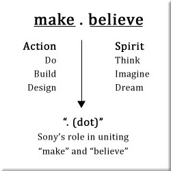
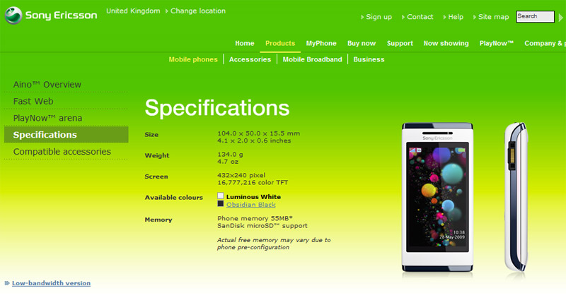
Feel free to use the comment field below and give me your best guess how much this kind of re-branding will cost. Old SonyEricsson.com design
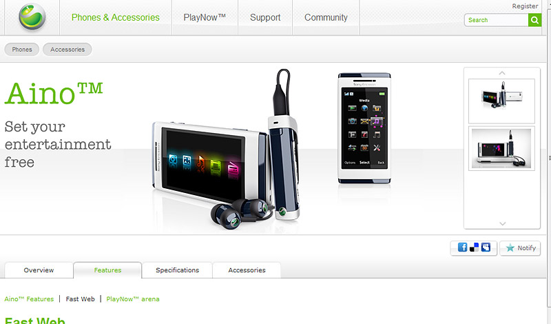
Updated / new design Comments On 28 Sep 18:33 SHEHZAD wrote BEST On 24 Sep 06:08 korbindallis wrote @John what phone spec page are you looking at? its got all the info you need to know if you want more go to the developer page if you didnt know that On 24 Sep 03:55 John wrote website not attractive,looks outdated.Still not much information on phones specifications,just have a look at nokia website.Very dissapointing indeed. On 23 Sep 19:46 JohnyCar wrote Want Satio!!!! On 23 Sep 18:41 thefanboy wrote want phones, better phones. period On 23 Sep 04:20 Anonymous wrote Welcome back SE |

 RSS feed