| Author |
Samsungs new UI |
lemmy31
Joined: Jul 06, 2004
Posts: > 500
From: Swadlincote
PM |
Oh come on Samsung it would appear that you have found another competitor to get "inspiration" from 
It is remarkably similar to MS "Modern UI".
|
|
|
aussieland1
Joined: Apr 11, 2013
Posts: > 500
PM |
Not sure what you're basing this on but;
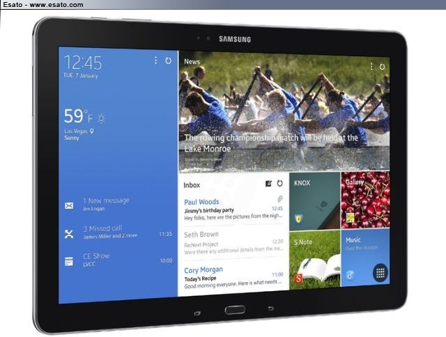
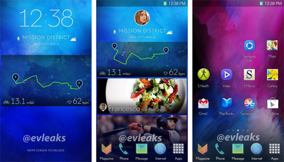
1) this ui is only for homescreens- app drawer still has icons
2) the widgets will cover the whole screen unlike on MS ui
3) this ui has multiple homescreens - unlike the MS one
To me it actually looks even more like the flipboard / htc blink rather than MS's |
lemmy31
Joined: Jul 06, 2004
Posts: > 500
From: Swadlincote
PM |
Your right It does look like Blinkfeed and Flipboard to a certain extent.
But on either of the two mentioned they are just news feeds, it would appear that you can launch apps from the "tiles" on this new UI..........very much like Windows 8(.1) and WP8 don't you think ? Either way it would appear that a lot of it is inspired by others
|
aussieland1
Joined: Apr 11, 2013
Posts: > 500
PM |
You are right those 2 are news feeds but I meant ui in terms of looks . As far as launching apps is concerned -you are correct normally pressing on a widgets you can launch the app. However it is unclear if an app shortcut can be configured as an widget on this new ui. My understanding was that the home screens are made up of gigantic widgets only.
So yes obviously Samsung has inspired from others like they usually do however I know they have a collaboration with flipboard so it is not just them copying flipboard and in my opinion as long as you don't clone someone inspiration can be good- how many things are 100% original these days? |
Tsepz_GP
Joined: Dec 27, 2006
Posts: > 500
From: Johannesburg, South Africa
PM |
On 2014-01-08 20:28:06, aussieland1 wrote:
Not sure what you're basing this on but;
1) this ui is only for homescreens- app drawer still has icons
2) the widgets will cover the whole screen unlike on MS ui
3) this ui has multiple homescreens - unlike the MS one
To me it actually looks even more like the flipboard / htc blink rather than MS's
That's how it goes around here, if Samsung get inspired by others it's seen as bad and is bashed, when others are inspired by one another it's fine.
I like what I've seen of it, reminds me of Play Newsstand, Blinkfeed and Flipboard (notice the former seem to be inspired by the latter yet no bashing, lol). The icons of this new UI also have a sort matte look to them and Samsung have got rid of the Menu button and replaced with the Recent Apps button while keeping the hardware Home button so still no screen real estate wasted by On screen keys unlike other Androids.
Looking forward to seeing the updated S Apps widgets e.g. S Planner, S Memo, Music Player and the exclusive Yahoo! Stocks and News widgets, use them a hell of a lot on both my S2 and S4 and with each new S model they seem to get much better.
Phone: iPhone 15 Pro Max Black Ti 512GB
Tablet: iPad Pro 11” 2020 Space Gray 256GB
Watch: Series 3 Nike Edition Space Gray
Droid: Huawei Mate 40 Pro 256GB |
Bonovox
Joined: Apr 13, 2008
Posts: > 500
PM |
Yes the new icons look more toned down 
Phone?? What phone?? |
|
|


 Posted: 2014-01-08 20:18


