| Author |
Sony Ericsson to add logo colours |
10123
Joined: May 29, 2008
Posts: > 500
PM |
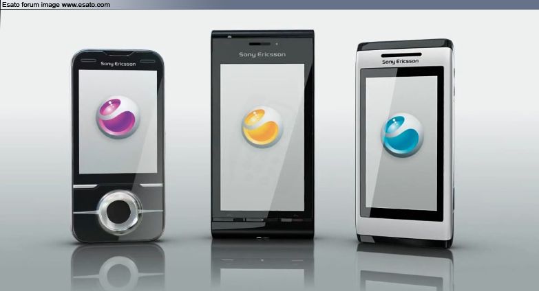
LONDON - Sony Ericsson is to refresh its brand identity by using coloured variations of its brand logo for the first time.
It marks the first significant change to its green �liquid identity' since the formation of the joint venture between Sony and Ericsson in 2001.
The mobile handset manufacturer has designed versions of its logo in several colours, including pink, blue, orange and purple.
Dave Hilton, UK marketing director at Sony Ericsson, said there was �clearly a desire to freshen up our advertising'.
The revamp comes ahead of the company's �biggest-ever' �8m campaign, promoting its Entertainment Unlimited proposition. This comprises the Satio, Yari and Aino handset models alongside its PlayNow music- and film-download service.
Sony Ericsson rolled out a fresh look for its mobile phone brand in 2006, when design agency Wolff Olins �wrapped' the green liquid logo within emotive messages.
The handset firm also started using vibrantly coloured ads to help it stand out from other technology brands.
Sony Ericsson is currently finalising a campaign due to launch next month, which will offer consumers who buy certain handsets the opportunity to win tickets to next year's football World Cup, which takes place in South Africa.
http://www.marketingmagazine.[....]ony-Ericsson-add-logo-colours/ |
|
|
tranced
Joined: Jan 19, 2006
Posts: > 500
From: Santo Domingo, wonDeRland
PM |
Not sure if i must say that  is desperated now. But getting a freshen up image(logo) is not what they really should do now. is desperated now. But getting a freshen up image(logo) is not what they really should do now.
Anyways, looking forward to see the new image 
|
Bonovox
Joined: Apr 13, 2008
Posts: > 500
PM |
Yes its all well and good and nice having a fresh new logo but does it change their current problems? No. Lets hope its a start of a new era then if thats the case. Their current low position and their bad quality control(although getting a little better)should be what they are focusing on. But lets hope their new upcoming phones and the new advertising campaign will attract consumers. But they need to stop building shoddy built handsets.
[ This Message was edited by: Bonovox on 2009-07-28 20:11 ] |
goldenface
Joined: Dec 17, 2003
Posts: > 500
From: Liverpool City Centre
PM |
It all helps I suppose. I wonder why they chose green in the 1st place. Red would have been better. I like the new EU logo, that stands out more. ;)
This message was posted from a WAP device |
brys182
Joined: Jun 15, 2009
Posts: 246
From: Negative Space
PM, WWW
|
got to check this out..,
goldenface, same here why green? anybody knows why sony ericsson comes with green logo? hehe
Don't be so quick to judge me, you only see what I choose to show you. |
Bonovox
Joined: Apr 13, 2008
Posts: > 500
PM |
Perhaps choosing green was to make them look environmentally friendly. Red does sound good dont like the idea of purple or pink. I would like an electric blue colour or something. [ This Message was edited by: Bonovox on 2009-07-28 21:30 ]
[ This Message was edited by: Bonovox on 2009-07-28 21:35 ] |
Bonovox
Joined: Apr 13, 2008
Posts: > 500
PM |
Will the logo be different colours for various different types of handsets or are they going for one colour or different colours for different regions of the globe?
Phone?? What phone?? |
hihihans
Joined: Mar 15, 2009
Posts: > 500
From: Netherlands
PM |
It would be nice if the colours came randomly, I can imagine a whole lot of swapping here. FT: red logo yari for pink one with purple logo. 
|
Bonovox
Joined: Apr 13, 2008
Posts: > 500
PM |
Pink logo for all them girly clamshell phones 
Phone?? What phone?? |
xell
Joined: Jan 15, 2006
Posts: > 500
PM, WWW
|
 |
se_dude
Joined: Nov 07, 2007
Posts: > 500
PM |
Ohh..2010 should be good for SE. They are the official handset of the 2010 Fifa world cup. They should release and market their phones as soon as possible before the world cup begins. The greatest platform ever. |
Muhammad-Oli
Joined: Jun 13, 2004
Posts: > 500
From: The NZ of L
PM |
Is that a photoshop, Xell? If it is an official image, then I guess I'm extremely used to the green logo, cause it looks fake. If it is a photoshop, then I apologise.
I do like the blue on Aino though!
This message was posted in the mail
2008, 2009, 2010 Best Australasian Member. |
xell
Joined: Jan 15, 2006
Posts: > 500
PM, WWW
|
Oli: It's from this video's end sequence: http://www.youtube.com/watch?v=CXsvYIErJRE |
Bonovox
Joined: Apr 13, 2008
Posts: > 500
PM |
Looks cool |
hihihans
Joined: Mar 15, 2009
Posts: > 500
From: Netherlands
PM |
Sure does. More colours. More fun.
|
|
|


 Posted: 2009-07-28 20:18


