| Author |
How the k800 should have looked! |
Superluminova
Joined: Feb 24, 2002
Posts: > 500
From: ...Mummies Tummy!
PM |
The cyber-shot sticker is just horrible on the k800/790 phones here how i think it should have looked and a few we colour example i think would have been nice aswell

Ps the pink is only there because its the must have mobile colour, apparently!
_________________
My Ebay Items: Buy,Buy,Buy!
[ This Message was edited by: Superluminova on 2006-03-03 18:00 ] |
|
|
Berry
Joined: Dec 09, 2005
Posts: > 500
From: UK
PM, WWW
|
funny pink....
|
numb
Joined: Feb 07, 2005
Posts: > 500
PM |
the pink and the brown are awfull, the rest looks good  |
axxxr
Joined: Mar 21, 2003
Posts: > 500
From: Londinium
PM, WWW
|
Nice work..likeing the red one!
[addsig] |
upper
Joined: Apr 17, 2004
Posts: > 500
From: London UK
PM |
Quote:
|
On 2006-03-03 19:00:26, tmag2005 wrote:
funny pink....
|
|
i think its ok for the ladies. |
datx
Joined: Dec 15, 2004
Posts: 130
From: Portugal
PM, WWW
|
Yeah i like them, but the sticker looks good as well
Everybody is complaining about the looks of K800 but, for me, it is one of the best designs SE has made so far |
fildy
Joined: Aug 24, 2004
Posts: 17
PM |
k800 without the Cybershot sticker:
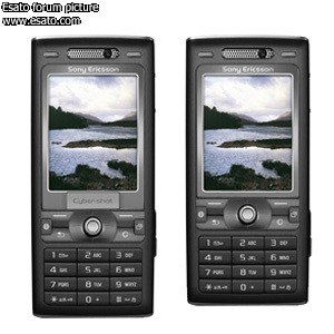
[ This Message was edited by: fildy on 2006-03-03 20:08 ] |
PeterKay
Joined: Jul 08, 2003
Posts: > 500
From: The Ummah
PM, WWW
|
Pink is a wanted colour at the mo, especially at my house!
|
ullyeus
Joined: Jul 09, 2004
Posts: 57
From: Malaysia
PM |
The red one reminds me of the nokia (dunno what model, too many models to remember lol) |
crowing
Joined: Jan 03, 2003
Posts: 475
From: La Sexocristo
PM |
3230
|
bengan_fnk
Joined: Dec 11, 2005
Posts: 14
PM |
Your design withoust the sticcer is just brilliant! |
Jools
Joined: May 21, 2003
Posts: > 500
PM |
I would've preferred it a bit like this:

- The keypad, joystick and screen higher up the phone
- Cybershot sticker at the bottom
- SonyEricsson logo below screen, not above
- Slightly taller buttons
|
korbindallis
Joined: Jun 18, 2004
Posts: > 500
PM |
JoolsG4
like the modified pic you really cleaned up that big gap in the middle of the phone were the cyber shot logo used to be and made a little space at the bottom so that u can text a little better
|
shaliron
Joined: Jan 15, 2006
Posts: > 500
From: Melbourne, Australia
PM |
@JoolsG4
Nice photoshop. Looks much better. Now if only SE was watching...
A wooden spoon is a spoon made from wood. Source: WikipediaWinner of: Best Thread (Huge SE Portfolio) 2007, Best Post (Huge SE Portfolio) 2007, Best Signature 2007, and 2nd Best Nickname 2007. |
bombadil
Joined: Feb 18, 2006
Posts: 111
From: Pune, India
PM |
@JoolsG4: Mate, your modified design is going to make a world of difference to the phone's messaging capabilities. The original is so reminiscent of the Nokia 3230 where owing to the low keypad, messaging was a nightmare and in a country like India where SMS rules the roost, your design will be god sent!! Awesome work man. Period! |
|
|


 Posted: 2006-03-03 18:57


