| Author |
What it takes to be a Mobile phone designer |
axxxr
Joined: Mar 21, 2003
Posts: > 500
From: Londinium
PM, WWW
|
I came across an interesting article on www.gotomobile.com on the mobile designer.
Mobile designers are the bridge between the end user and the engineering community. Unlike the web or mainstream design world, mobile designers cannot be simply visually or brand-oriented. It is mandatory to keep up to date on the latest technologies and handsets, maintain client and company education, and articulate the importance of authoring for one platform or another. Mobile designers need to be highly conceptual, understand the importance of brand, and yet maintain a close eye on the usability and end users� specific needs.
Although tools and standards information are available to the design and development community at large, it is important for individual designers to keep up with the latest updates through developer lists and proactive education. Much like those developers who mastered the quest for web standards, there are communities of mobile developers who have worked out the various tweaks and solutions to cross-platform authoring issues. Keeping up with published standards available through various developer sites and the W3C are a solid start, but even these sites are not as up to date as lists and forums.
As mobile devices become smaller and more compact, the amount of information they need to convey increases. The convergence of functions and constant addition of features create layers of complexity in navigation and usability of mobile user interfaces. Mobile designers and developers need to understand how to create the best user experience possible within these constraints. Unlike the desktop web environment, the mobile web has an entirely different set of user requirements to consider. The following are a few key areas to consider when creating user interfaces for mobile devices.
Visual Display and Screen Attributes
Components of the user interface are the visual display and screen attributes, and the response/input methods that include input keys and �soft keys� (which are programmable and available on every handset) along with stylus touch screens and QWERTY keyboards. For the visual display; components include navigational menus, icons, graphics, text and display screens. For the screen attributes; display size, resolution, brightness and color are considerations. Additional screen attributes include touch screens and alternative input methods for graphics and text, which fall into the response/input category. Traditional keyboards recognized as �numeric pads� have multiple tasks associated to each on, depending on what �mode� is being used. Alternative factors such as audio input and volume, as well as alternative single function buttons for camera and web browsing activation are added on specific devices for increased ease-of-use. Sony Ericsson introduced a 4-way joystick navigation popular on its 7610 series devices. Some of these buttons are programmable and others are hard coded. Designers and developers need to keep all input methods and functionality in mind when developing an optimal user experience.
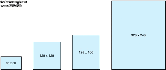
Evolution of Mobile Screen Sizes
Hard and Soft Keys
Sofkeys are programmable and generally correspond to a screen label. Most mobile devices have at least two soft keys allowing developers to program single responses (accept/decline) to various screens. For the scrolling and selection of menu items, the introduction of the 4-way joystick allowed consumers more control over device menu and selection. The scroll wheel introduced by Nokia allows for 4-way scrolling and selection as well, with one-handed usage. Programmable keys have their challenges as often the end user has a learning curve due to lack of permanent labeling, using the �return� or �back� key (which is usually hard coded and does not need to be created as a soft key) often as to amend mistakes. Positive experiences using all means of programmable and dedicated keys require testing and feedback cycles to determine the most intuitive use.
Text Input
Various methods of text input have been tested and integrated into mainstream use. Entering text with a standard numeric keyboard requires a �multi-tap� functionality that is also based on �feel� allowing text input with little visual confirmation. T9 predictive text �offers the most commonly-used word for every key sequence you enter by default and then lets you access other choices with one or more presses of the NEXT key � and learns words and expressions unique to each user. Even voice activated input is also used on mobile devices for hands free dialing. For newer smartphone devices, a touch screen has become commonplace, with stylus or QWERTY keyboard options. For mobile designers, it is important to keep input when requested very short, and specific URLs should be as limited in characters as possible.
Text input studies at Nokia Research Center show conventional keypad �multi-tap� entry at 8 to 9 words per minute (wpm), predictive text input at 20 wpm, and QWERTY keyboard input at up to 35 wpm. This is in comparison to 50 � 80 wpm on a traditional PC-based keyboard.
Navigation and Menus
Traditional desktop environments and rules surrounding navigation do not translate to small screen devices. Especially web browsing from mobile phones. Instead of having the �no more than five to seven� menu items displayed on one screen in the web environment, it is suggested to have as many as 30 links, making it easy for mobile users to scroll and make decisions from the top level. Nokia Research states:
�We are often asked about the optimal number of links on a navigational page. The old usability rule has been 7 (+/- 2) items in a menu, but it seems this is not the best rule with links on a WAP page. In most cases, it is better to have 12 links on a page and a site hierarchy of 3 levels than 7 links on a page and 4 hierarchical levels. Actually up to 30 links can be shown on a page, provided that they are tightly bound together and they can be listed in a logical order .�
Mobile user interfaces should contain relevant and clearly labeled links and should avoid navigation down several levels. Little Springs Design recommends against using breadcrumb navigation, noting breadcrumb navigation �adds visual clutter and extra clicks in the mobile environment. � There are many more details to consider when creating menu systems, naming and labeling, as well as content. Keeping the navigation and �navitorial copy� (descriptive text) as clear and action-oriented as possible will help simplify and direct the end user towards task completion.
When developing a web-based application or portal screen, designers should target one or two devices and create an optimal experience for that specific screen size and browser. Information regarding target audience usage of specific device types should be gathered if available. Available emulators will help to preview and demo the mobile site. If the exact phone profile is not available, often there is a close second that will have the same screen size and general functionality. However emulators should not be used for actual QA and accurate display. This should happen from the device itself, with the designer posting the mobile site to a staging server and testing the experience out on the targeted models.
[addsig] | |
|
Johnex
Joined: Nov 26, 2002
Posts: > 500
From: Stockholm/Sweden
PM, WWW
|
Nice and useful man, thanks!
This message was posted from a Z1010 |
axxxr
Joined: Mar 21, 2003
Posts: > 500
From: Londinium
PM, WWW
|
Yes it is a rather interesting article!
[addsig] | |
|
Access the forum with a mobile phone via esato.mobi
|


 Posted: 2006-02-11 07:24


