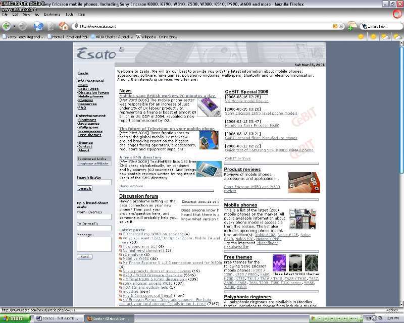
| Author |
New Esato logo! |
shaliron
Joined: Jan 15, 2006
Posts: > 500
From: Melbourne, Australia
PM |
I do like amnesia's logo best. Looks slick without being too futuristic and fits in very well. Nice one!
A wooden spoon is a spoon made from wood. Source: WikipediaWinner of: Best Thread (Huge SE Portfolio) 2007, Best Post (Huge SE Portfolio) 2007, Best Signature 2007, and 2nd Best Nickname 2007. |
|
|
Mad_Bob
Joined: Dec 28, 2004
Posts: > 500
From: A Bread Bin
PM, WWW
|
Thought I would give it a go...

Oh my god! a wooden goat!. |
Mad_Bob
Joined: Dec 28, 2004
Posts: > 500
From: A Bread Bin
PM, WWW
|
A rough site image

Oh my god! a wooden goat!. |
dazbradbury
Joined: Nov 24, 2002
Posts: > 500
From: UK - Derby/London
PM, WWW
|
looks good mad_bob, not sure if i prefer it to the current one though.
Think i'd miss the esato style if it changed...! lol.
|
axxxr
Joined: Mar 21, 2003
Posts: > 500
From: Londinium
PM, WWW
|
now that i could live with...very nice,..good work mate!
[addsig] |
below24
Joined: Jul 16, 2004
Posts: > 500
From: London
PM, WWW
|
Indeed excellent work!
|
shaliron
Joined: Jan 15, 2006
Posts: > 500
From: Melbourne, Australia
PM |
I think that with all the 'objection' against the changing of the esato logo, maybe we should just centre the main text part first. It looks fresh without changing anything dramatic like the logo and we can work up from there.

A wooden spoon is a spoon made from wood. Source: WikipediaWinner of: Best Thread (Huge SE Portfolio) 2007, Best Post (Huge SE Portfolio) 2007, Best Signature 2007, and 2nd Best Nickname 2007. |
Mad_Bob
Joined: Dec 28, 2004
Posts: > 500
From: A Bread Bin
PM, WWW
|
I see your point...
Has Laffen commented on anything yet though, I mean recently... what are his thought so far, does anybody know.
Maybe he doesn't want to make any changes at all.
Oh my god! a wooden goat!. |
watermelon
Joined: Dec 24, 2005
Posts: 69
PM |
kinda strange i like Sony Ericsson and Vodaphone's logo in a circle |
Mad_Bob
Joined: Dec 28, 2004
Posts: > 500
From: A Bread Bin
PM, WWW
|
Do you mean that you just like logos which are circular or that you want the new Esato logo to consist of a Voda and SE logo in a circle?
Oh my god! a wooden goat!. |
BobaFett
Joined: Jan 06, 2004
Posts: > 500
From: Kamino (wish it would be Lund)
PM, WWW
|
i think he ment theat the circle with the logo in it looks good.
|
Residentevil
Joined: Feb 29, 2004
Posts: > 500
From: Raccoon City, USA
PM, WWW
|
I think the current logo is fine.
Tough times don't last, tough people do!
Free Tibet |
axxxr
Joined: Mar 21, 2003
Posts: > 500
From: Londinium
PM, WWW
|
I think it would be nice to see some new logo designs!
[addsig] |
KingBooker5
Joined: May 12, 2007
Posts: > 500
From: London, England
PM |
Why dont we photoshop some esato logos,and see what they think? |
axxxr
Joined: Mar 21, 2003
Posts: > 500
From: Londinium
PM, WWW
|
On 2007-06-18 19:29:44, KingBooker5 wrote:
Why dont we photoshop some esato logos,and see what they think?
yes why not.
[addsig] |
|
|