| Author |
Windows Vista Transformation Pack 1.0 |
tosinv
Joined: Aug 02, 2006
Posts: 216
From: India
PM |
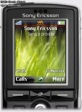
The third theme is included in the pack.Give it a try its not that bad as is in the pic |
|
|
ap0lo
Joined: Nov 19, 2005
Posts: 116
From: Brazil
PM, WWW
|
But I realy like my theme + menu!
And I also edit my layout.xml so that the operator logo can disapear.
I would like to give a try only on the third theme.
=) |
tosinv
Joined: Aug 02, 2006
Posts: 216
From: India
PM |
Here u Go mate
http://rapidshare.de/files/30122630/WindowsVista66059.thm.html
and the third theme
http://rapidshare.de/files/30122859/Windows_Vista.thm.html
And I thought that some people do like opeartor logo thats why I didnt deleted it from the layout anyways u can delete it and use as its fonts are very cool just like k800.
Enjoy the theme
Cheers |
tosinv
Joined: Aug 02, 2006
Posts: 216
From: India
PM |
Hi all
Guys Please leave ur feedback about the Vista Pack 1.0 as it will help to take out the flaws if any in the Vista Transformation Pack 2.0.How did u like the vista 1.0 keep posting and keep this thread alive.
If anyone can put some more screen shots or put a live video of the menu working on their it would me much appreciated as i dont have a second camera.Please
Thanks
Cheers |
nomy
Joined: Dec 04, 2005
Posts: 91
From: B'ham, UKay
PM |
hi...
Tosin.... the Windows_Vista Theme looks nice but there is a thing u can improve...
as u can see in the picture preview u posted earlier.. the the transparent black strap with the Walkman logo on... it should be more thicker... lets take the battery indicator as an example... the margin between the top of the battery indicator and the top on the screen should be the same as the bottom of the battery indicator and the bottom of the black transparent strap....
hope u can fix it... or send a link to the fixed one...
Thanks |
tosinv
Joined: Aug 02, 2006
Posts: 216
From: India
PM |
Hello
I have removed the upper bar where the walkman logo is .Check this out and let me know if any changed required in this theme.
Here is the link
http://rapidshare.de/files/30174781/VistaV2.thm.html
By the way did u like the menu.I am going to post some pics of my new Vista pack 2.0 sooner .
Thanks
Cheers |
tosinv
Joined: Aug 02, 2006
Posts: 216
From: India
PM |
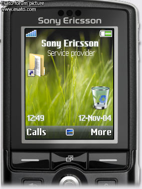
Here is the screen shot
 |
nomy
Joined: Dec 04, 2005
Posts: 91
From: B'ham, UKay
PM |
hi tosin.... actually i did like the transparent strap part with the logo on it.... this one is good as well.... i am looking forward for version 2.... thanks a bunch... i have changed the menus already.. looks like laptop sidekick....lol.... GREAT!!! |
tosinv
Joined: Aug 02, 2006
Posts: 216
From: India
PM |
Thanks mate for the appreciation a lot.I also guess that the logo of walk man was more good anyways I will make that one as u told me to and include in the version 2.
Sooner I am going to release it.Its almost done I will go to the office today borrow my friends cam and grab some pics of the Vista pack 2 and post it.
Thanks again
Cheers |
nomy
Joined: Dec 04, 2005
Posts: 91
From: B'ham, UKay
PM |
hi again...
tosin.. please correct one more thing....
the menu-on-menu part looks all...u know..Messed up..take a look....
Edit: This is VistaV2
[ This Message was edited by: nomy on 2006-08-21 08:55 ] |
tosinv
Joined: Aug 02, 2006
Posts: 216
From: India
PM |
Allright I will correct this and soon post a link |
xodeus
Joined: Sep 09, 2004
Posts: 55
From: Denmark
PM, WWW
|
Hi it has been many days now?
Could you please post a link for vista tranformation pack 2.0?
Or maybe the beta you have?
Sony Ericsson W715 black on 3.dk
SW:R1EA033 EROM:1200-4341 SEMCBOOT:R6A018 |
tosinv
Joined: Aug 02, 2006
Posts: 216
From: India
PM |
Ya I will psot in a day or two just tring to fix two themes for it.Sorry bout this I am in th office otherwise I would have completed it and posted it
Thanks
|
nalbagli
Joined: Jul 09, 2006
Posts: 302
PM |
could someone explai how to install it |
HarvJH
Joined: Jan 30, 2006
Posts: 319
From: Essex, UK
PM |
@tosinv
If you didn't see my post on the SE-NSE forum then i will write it here, i think you should try making the icons 45 x 35 unselected and 50 x 50 selectedi think it would look better.
[ This Message was edited by: HarvJH on 2006-08-22 10:40 ] |
|
|


 Posted: 2006-08-20 18:16


