| Author |
New Esato logo! |
whizkidd
Joined: May 14, 2004
Posts: > 500
From: India
PM, WWW
|
More designs folks....we have 80000+ memmbers here and only a handful of designs??
I would have made one if i was capable of.... 
Now get to work!!!

T230 >> T610 >> Ngage QD >> N73 >> N85 >> Omnia HD >> And countless other review units |
|
|
kk.226
Joined: Nov 04, 2004
Posts: > 500
From: London
PM |
Quote:
|
On 2006-01-15 14:41:39, axxxr wrote:
Off Topic but JN what the hell are you talkin about mate? 
Quote:
|
On 2006-01-14 20:58:07, JN:
@laffen - Just a 'Q' here mate . . . Don't you THINK your King needs a Queen 
|
|
|
|
Finally, someone else who doesn't understand the humour!
I'm pretty disappointed that Vanquish has stopped showing his designs, and would've like to see more support on here from other members....
His designs were very impressive and I would've loved to see them incorporated into the design of esato, sure esato doesn't NEED a re-design, but it would certainly help, and I for one would like to see it happen.
|
Davo_169
Joined: Sep 06, 2004
Posts: > 500
From: perth/thredbo
PM, WWW
|
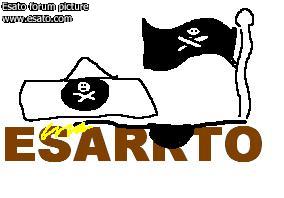
the pirate esato
|
batesie
Joined: Feb 13, 2004
Posts: > 500
From: London, UK
PM |
Quote:
|
On 2006-01-17 12:04:39, trogdor the burninator wrote:
the pirate esato
|
|
Harr Harr matey!
[addsig] |
methylated_spirit
Joined: Jul 07, 2004
Posts: > 500
From: Bonnie Scotland
PM |
Some really good logos there, interesting, innovative, well thought out designs. I'm going to throw my hat into the ring with this baby:
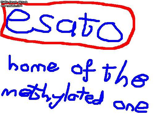
Hello, Scroto!
U.G.L.Y. You ain't got no alibi, you ugly! |
methylated_spirit
Joined: Jul 07, 2004
Posts: > 500
From: Bonnie Scotland
PM |
This one, i think its icewinds...what if you made the stripes at the side into an E instead of having it beside the E? Perhaps rearrange it into the ericsson logo?

Hello, Scroto!
U.G.L.Y. You ain't got no alibi, you ugly! |
*Jojo*
Joined: Oct 15, 2003
Posts: > 500
PM |
@meths - Your last post (logo) looks like it was designed for a commercial airline posted on the . . . tail Nice though . . .
[addsig] |
batesie
Joined: Feb 13, 2004
Posts: > 500
From: London, UK
PM |
i prefer the 'paint' one...
[addsig] |
axxxr
Joined: Mar 21, 2003
Posts: > 500
From: Londinium
PM, WWW
|
Here is my sad attempt...
 [addsig]
 |
*Jojo*
Joined: Oct 15, 2003
Posts: > 500
PM |
@axxxr - The BEST for me so far ! Metallic and nice contour . . . VIVA NPJN !
[addsig] |
jenbones
Joined: Feb 19, 2005
Posts: > 500
From: london
PM |
Don't mean to spoil your fun, but do you ACTUALLY think that Laffen will consider changing a logo which has served the site since birth, he made/had input and look fine as it is?
 1500+ Posts |
marlonski
Joined: Oct 16, 2004
Posts: > 500
From: UK
PM |
Quote:
|
On 2006-01-17 13:01:20, methylated_spirit wrote:
|
|
This is the one for me so far 
|
axxxr
Joined: Mar 21, 2003
Posts: > 500
From: Londinium
PM, WWW
|
How about a bit of a prince of persia look?
 [addsig]
 |
Gigs
Joined: Jan 19, 2004
Posts: > 500
From: The planet Snibertron!
PM, WWW
|
At the risk of going off topic.. I like the current one 
|
dazbradbury
Joined: Nov 24, 2002
Posts: > 500
From: UK - Derby/London
PM, WWW
|
Ok, well given it's late, and i had about 20 minutes to spare, this is what i came up with...

** UPDATED LATER IN THREAD TO THIS: **

Obviously it can be improved...
[ This Message was edited by: dazbradbury on 2006-01-19 16:07 ] |
|
|


 Posted: 2006-01-16 22:01


