| Author |
Esato's new look |
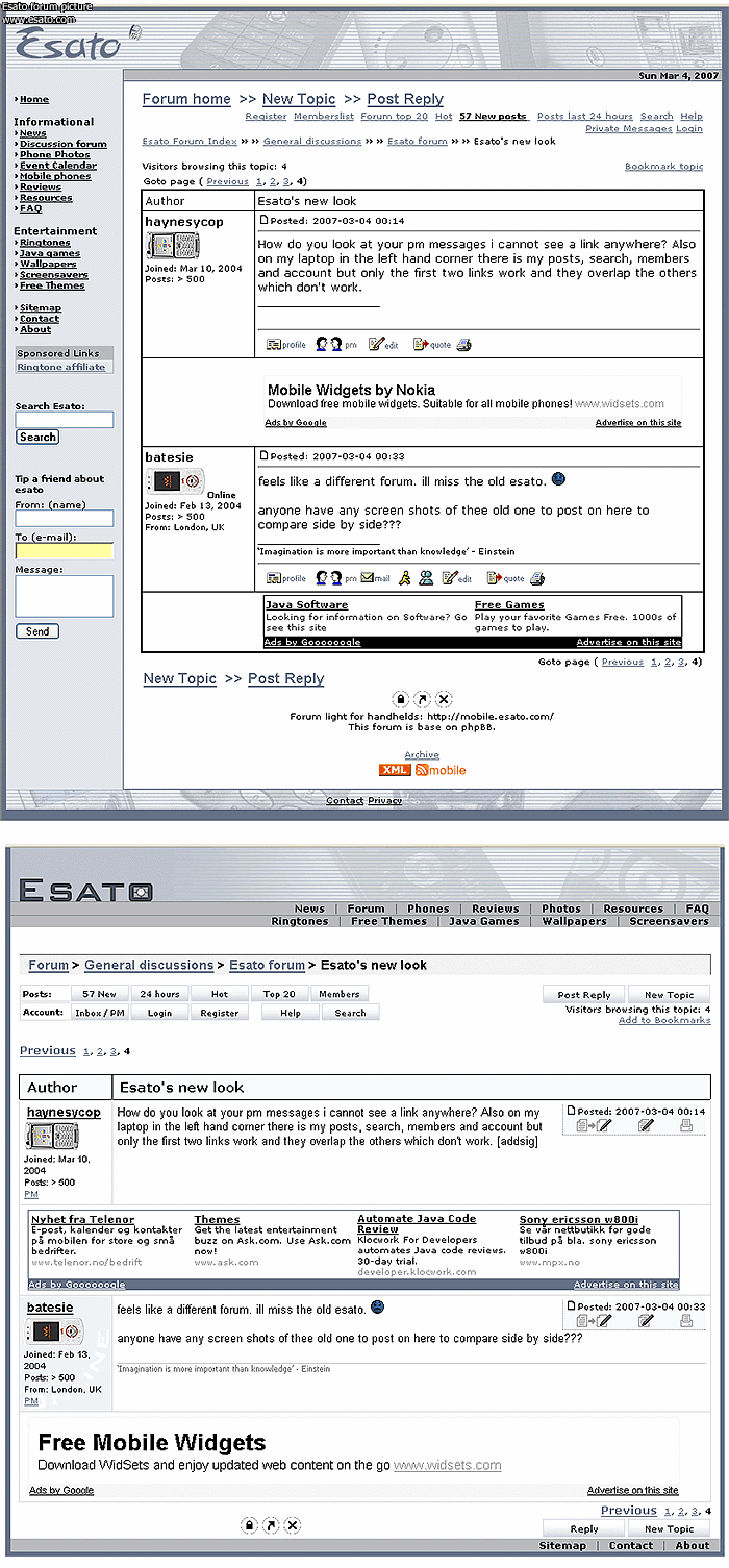
haynesycop
Joined: Mar 10, 2004
Posts: > 500
PM |
How do you look at your pm messages i cannot see a link anywhere? Also on my laptop in the left hand corner there is my posts, search, members and account but only the first two links work and they overlap the others which don't work.
|
|
|
batesie
Joined: Feb 13, 2004
Posts: > 500
From: London, UK
PM |
feels like a different forum. ill miss the old esato. 
anyone have any screen shots of thee old one to post on here to compare side by side???
[addsig] |
PeterKay
Joined: Jul 08, 2003
Posts: > 500
From: The Ummah
PM, WWW
|
i'm missing the old esato too!
doesn't feel the same.
|
laffen
Joined: Aug 07, 2001
Posts: > 500
From: Oslo, Norway
PM |
This post has attached an image of the old layout compared to the new one. Much of the planed changes is still to be carried out. It is mostly the "shell" (head and footer) of each page that has changed. the viewtopic.php page is very close to, if not completely like the final result will be. The rest of the forum will be adjusted some more. The missing menu in OS-X Safari is of course being investigated. In contrast to what one of our members wrote earlier, have we tested the new design in all the most used browsers before releasing the new pages. The new design follows the W3 standards. BTW. Please take the time to look at a couple of pages on the w3.org site. They use a floating width layout just like you see here. You are not supposed to view such pages fullscreen on a 1900x1200 pixel monitor.
I'll try to explain what and why we have done here:
The old Esato was designed for 800 x 500 displays which was a common scree resolution back in 2001 when Esato was born. The design was fixed in width and I (the designer) told you how I wanted the site too appear in your browser. The new design is more flexible giving more power to the viewer. Those of you interested in web design and such should take a look at this page or maybe particular the article by usability expert Jacob Nielsen named Screen Resolution and Page Layout (Summary:
Optimize Web pages for 1024x768, but use a liquid layout that stretches well for any resolution, from 800x600 to 1280x1024.) The new Esato design is stretchable from 800 to 1200 pixel in width.
The menu elements on the old design was ordered almost by random. We used the same ordering as the original phpBB forum setup. The new navigation is divided into post/topic related links, and links related to your member account. I'll only go into the viewtopic.php page which you most likely are looking at right now. All the links and info about the poster is moved to the left of the page. The center has the main content; the post itself, and you will find the post data and post related links on the right side of the page. It should now be easier to follow the left margin of the post text without bumping into signature ads and forum link icons.
If you actually compare how the information is organised in the image below, I really don't understand what some of you are complaining about.
I am reading through the feedback given, but can't respond to them all. Yes, the logo change might not be final.
thanks folks
[ This Message was edited by: laffen on 2007-03-04 03:45 ] |
*Jojo*
Joined: Oct 15, 2003
Posts: > 500
PM |
@laffen - This is your SITE and we as MEMBERS just have to ADHERE what is SEEN here . . . everybody will get USED to the new lay-out I'm sure . . . The Esato-logo I think must really be changed (since you said that it's NOT final) . . . it's all BOXED as I see it . . .
As the sayin' GOES: \"There's ALWAYS a FIRST time in Everything\" . . .
[addsig] |
abbafan1972
Joined: Jan 05, 2006
Posts: > 500
From: Birmingham, UK
PM |
Sorry, but I don't like the new layout at all. It looks cheap and tacky. I find it difficult to see where one post ends and the next one starts.
|
BobaFett
Joined: Jan 06, 2004
Posts: > 500
From: Kamino (wish it would be Lund)
PM, WWW
|
hope the wml look wont be changed, got way too much used to it
This message was posted from a E60-1 |
fatreg
Joined: Jul 26, 2003
Posts: > 500
PM |
@ miss c..
you can't in safari...
you need to use firefox or windoze...
i made a wee thread about it with a pic!
fatreg
_________________
"live fast, die young"
please sponser me
i  my 8700f my 8700f
[ This Message was edited by: fatreg on 2007-03-04 12:38 ] |
Vexii
Joined: Jun 26, 2005
Posts: 149
From: Croatia
PM |
I really like the new look. It looks fresh and clean. 
Admit nothing, deny everything and make counter-accusations. |
shyam335
Joined: May 25, 2004
Posts: > 500
From: 127.0.0.1
PM |
Large images dont scale well to width it seems..
There are a terrible lot of lies going around the world, and the worst of it is half of them are true - Winston Churchill
We shape our buildings; thereafter they shape us - Winston Churchill |
axxxr
Joined: Mar 21, 2003
Posts: > 500
From: Londinium
PM, WWW
|
On 2007-03-04 02:04:19, laffen wrote:
I really don't understand what some of you are complaining about.
We basically miss the simplicity of the old design, ..esato was always unique because of the very basic "no frills" layout, now it just looks like any other forum.
sorry but i still prefer esato how it was.
I still don't see how new features (logo ect) can't be retained with the old look?
[addsig] |
Jim
Joined: Jan 20, 2002
Posts: > 500
From: Belgium
PM |
Ok here are some things I don't really like:
- 2 seconds job on photoshop for the logo.
- the online status (curved).
- signature following post meaning in big blank if reply was only on one line, it should be on bottom no matter what.
- google adsense between post 1 & 2 could be placed between the "Members" and "Post reply" icon?
- more colors !!! everything is in a blue/gray gradient, even adsense (doesn't catch up the eye if you ask me), it's so 2000 ...
Other than that I really like how it use the complete width of the screen and how the quote/edit/print buttons are placed. |
Superluminova
Joined: Feb 24, 2002
Posts: > 500
From: ...Mummies Tummy!
PM |
I have to say i'm not to taken with the new look, As my screen is really high res and its far to streched across the page.
I like the old style more and new logo just in my view looks kind of cheap.
OBEY GAINT |
PeterKay
Joined: Jul 08, 2003
Posts: > 500
From: The Ummah
PM, WWW
|
like the old style better, this is too much in your face if you know what i mean!
|
asfaq
Joined: Sep 10, 2004
Posts: 41
From: Mumbai, India
PM, WWW
|
i think the new board and design look swell.. its just a matter of getting use to the layout!
good job laffen !!
[addsig] |
|
|


 Posted: 2007-03-04 00:14


