Google releases design guidelines for Android 4.0
16 January 2012 by Olav Hellesø-Knutsen Google has launched a web site with useful design guidelines for Android 4.0 app developers
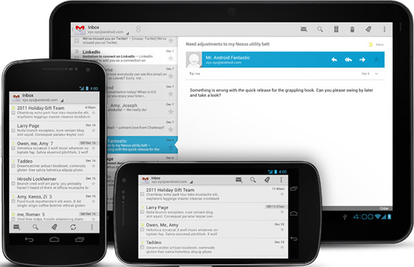
We think it is about time that Android developers got someplace to look for simple rules to follow when developing Android apps. Android is out in version 4.0 now, and we have been able to buy Android devices for over three years. Close to to 500.000 apps has been developed so far without any recommended UI rules to follow. We are convinced that Google have used design guidelines internally so it is strange they haven't made any of these available to the public earlier. May of the samples used in the guidelines are taken from the development of Google apps such as YouTube, Google books and Gmail. As you may know, Android 4.0 is the merge of Android 2.3 Gingerbread for mobile phones and Android 3.2 Honeycomb which was built for tablets only. Android 4.0 Ice Cream Sandwich version can be used both for smartphones and tablets. The need for design guidelines increased together with the new range of display sizes. It was easier before when the display size was limited to sizes between 2.6 and 4 inches. With the introduction of 7 and 10 inch tablets, app developers can develop apps for a wider audience with larger displays. The inclusion of the Halo theme on all Android 4.0 devices is a compatibility requirement set up by Google which makes the development of ICS apps a little easier. Developers can now rely on the existence of this default theme on all devices released in the future. This is an example of instructions given by Google: Touchable UI components are generally laid out along 48dp units
Why 48dp? If you design your elements to be at least 48dp high and wide you can guarantee that:
There is nothing magic in these few advices, but they will guide developers into making more user friendly apps having more intuitive interfaces. When and how to use buttons, tabs, lists, text fields and dialogues are just few of the many guides. Some of the others explains a normal navigation path and what the user expects to happen when a back-button is pressed. 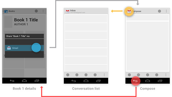 In addition to the guides for visual presentation, Google has posted a couple of tips for improving the writing styles. Confusing dialogs instructions like Use GPS satellites. When locating, accurate to street level. should be replaced with GPS. Let apps use satellites to pinpoint your location The full set of design guidelines can be found over at the Android developer site
Alternatively post this in the Esato forum Please sign in to your Esato account to leave a comment regarding this article
|


 RSS feed