Sony Ericsson - new and vibrant brand look connects with the individual
2 October 2006 by axxxr Coinciding with its 5th anniversary celebration, Sony Ericsson today unveils a new look for its global mobile phone brand.
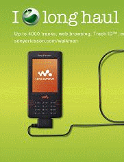
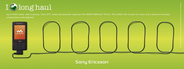
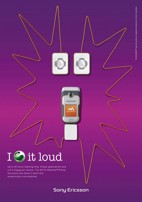
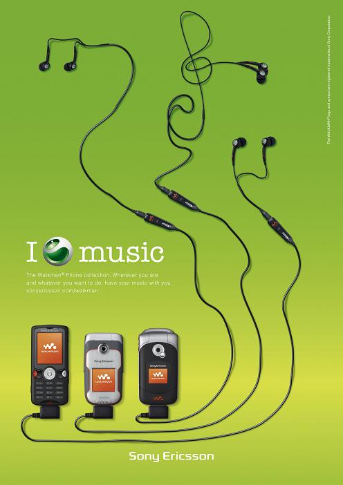
Based on a simple core concept and a new colourful execution, the companys famous green logo, known as the liquid identity, is wrapped within a message that focuses on the individual and their feelings for what Sony Ericssons products, accessories and applications enable them to do. The result is an engaging new brand treatment that will differentiate Sony Ericsson, and project the full attributes of the companys innovative mobile phones. Designed by leading global brand consultancy Wolff Olins, the new look will be rolled out from this month. Sony Ericsson is entering a phase of aggressive growth and to succeed it is important that people everywhere can connect with us at every level," says Dee Dutta, CVP and Head of Marketing for Sony Ericsson. Over the past five years our brand has become established in the minds of our consumers. Now it is time for us to appeal to both the minds and the hearts of consumers. The mobile device will become increasingly central to our lives in many different ways and as this happens it is vital that our brand stands out above others with energy, passion and excitement," he adds. The brand identity includes a new range of vibrant colours, deliberately selected to stand out from the white, grey, black and blue tones used by most technology brands today. In addition to the new colours, there is a strong central concept comprising two key elements a worded message and the portrayal of sentiment around the Sony Ericsson liquid identity. The rules are simple: the message always starts with I, the individual, followed by the liquid identity and then a message relating to the things the individual loves, cares about or is inspired by. This framework can be applied in any number of ways, in any language, connecting with the audience visually and instantly. Andrew Warner, Head of Brand Management for Sony Ericsson, explains how the identity is designed to connect with its audience: As soon as you see this there is immediate engagement between you and the Sony Ericsson brand. The message is that it is treating you as an individual it is not telling you what to think about Sony Ericsson, it is reflecting what you think. This is not just a traditional, static brand identity. We plan to increase our use of interactive media to build a dialogue with consumers around the world and effectively start co-creating our brand messages with them." People want to know how our products can add to their life - how connected they can be, how much fun they can have, how much better they can work, and more. Our new brand identity relates our products to the things people care about in a very simple way. It is focused less on whats inside the products and more on what consumers get out of them," he concludes. Simplicity is the underlying principle that runs through every aspect of Sony Ericssons business, from product design to marketing, so the new brand look will further strengthen the companys commitment to this approach. Adam Throup, Creative Director at Wolff Olins elaborates: We are developing a distinctive global brand that is flexible enough to embrace local differences, speaking directly to people about what they want and what they love doing."
Comments On 29 Oct 16:58 EricScott wrote This is kind of "me too design" circa 5 years ago...I guess thats what the phones really say...If you look for innovation in brand I give Nokia the nod...although, innovation in actual phones, HTC is king. Sony needs to simplify their offering and their modeling scheme. Also the experience needs to be QA'd more - the software is very rough around the edges. Sony have fantastic hardware products. Much better than Nokia - but Nokia have better branding and therefore sell more. On 8 Oct 09:05 WhiteEye wrote I [SE logo] cute W800 image On 4 Oct 20:08 renesis wrote I :se: My T630... On 4 Oct 10:21 manfran wrote Brilliant play of visuals using the product! Very striking, creative and fresh! I like it. Better than the previous ads which was kinda boring. This will be an an effective campaign, im sure! Congrats SE On 4 Oct 00:55 SloopJohnB wrote I agree. But perhaps SE is changing their design because it cannot /dont wanna release high tech phones. Its more provitable to sell a higher number of mid end phones than to focus on high end phones that will always remain one step behind of some competitors, like nokia. Instead of new techs they r investing on new design, new look and feel and strong brands. Pretty much what nintendo is doing now, since it cannot compete with sony in terms of tech nintendo is focusing on different design and usuability of the video games. A company has gotta do whatever it takes to survive e sell more products.. otherwise.. On 3 Oct 23:07 rssndrsn wrote i wish SE could be more emotional with their products, not only with advertising. They now have the momentum to release more feature-rich phones due to the success of the Walkman and Cybershot branded phones. SE should not let this oppurtunity to slip away! On 3 Oct 22:25 SloopJohnB wrote The new marketing and design looks great!! Just wish the phones were a bit better... besides that is one of the best mobile campaigns ever! |


 RSS feed