| Author |
Sony Ericsson has updated their website |
jcwhite_uk
Joined: Feb 18, 2004
Posts: > 500
From: Dorset, UK Phone:Xperia Z1
PM, WWW
|
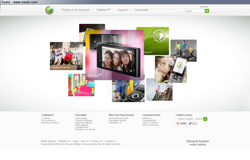
I may be a little behind but it appears that  have updated their website and included their new coloured logos. have updated their website and included their new coloured logos.
Checkout my photos at My Website"Duct tape is like the force. It has a light side, a dark side, and it holds the world together." |
|
|
tranced
Joined: Jan 19, 2006
Posts: > 500
From: Santo Domingo, wonDeRland
PM |
i saw a few mins ago they changed something, but didnt think it was the whole site.
[ This Message was edited by: tranced on 2009-09-22 18:20 ] |
mediar
Joined: May 05, 2008
Posts: > 500
From: Varna, Bulgaria
PM, WWW
|
I don't like it.  I'm a bit conservative person and don't like the things to change. I'm a bit conservative person and don't like the things to change.
And why the default favicon is the pink logo? 
[ This Message was edited by: mediar on 2009-09-22 18:47 ] The best mobile phone brand died with Sony Ericsson's death. Shame on you Sony for killing it! And, of course, for ruining the Xperia brand... Mediar's Site |
tobias84
Joined: Jul 19, 2004
Posts: 310
From: Sweden
PM |
Looks very good. nicer then before, just wait for underpages to be updated too.
|
tranced
Joined: Jan 19, 2006
Posts: > 500
From: Santo Domingo, wonDeRland
PM |
esato did change some years ago. why can't do the same? 
|
crossmatched
Joined: Jan 05, 2006
Posts: > 500
From: RP
PM, WWW
|
loving the new look 
by including photos, there is more depth and emotion
it appears more humane.
and more diverse.

www.secondmanonthemoon.blogspot.com
we are all works under progress |
Bonovox
Joined: Apr 13, 2008
Posts: > 500
PM |
Change is good especially when it comes to how things have been @ Sony Ericsson lately.
Phone?? What phone?? |
NightBlade
Joined: Jul 29, 2007
Posts: > 500
From: Nessebar, Bulgaria
PM |
Looks nice and fresh. I like it.
Also, its simpler looks and animations are a nice plus.
|
crossmatched
Joined: Jan 05, 2006
Posts: > 500
From: RP
PM, WWW
|
the old website is colorful.
now, the new site is not just with color. but with substance too.
www.secondmanonthemoon.blogspot.com
we are all works under progress |
tranced
Joined: Jan 19, 2006
Posts: > 500
From: Santo Domingo, wonDeRland
PM |
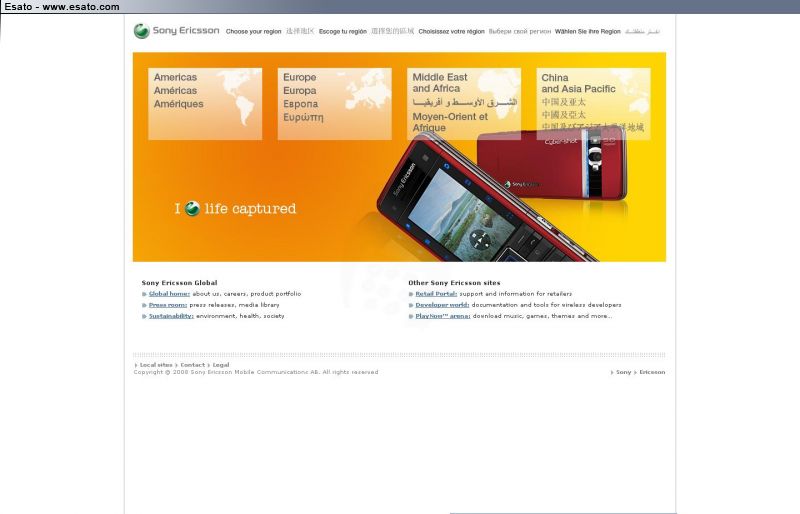
wondering when they'll change this one:
|
crossmatched
Joined: Jan 05, 2006
Posts: > 500
From: RP
PM, WWW
|
hope soon. or better yet asap
the website in my country has already been changed
very nice! reminds me of picassa or cool iris
www.secondmanonthemoon.blogspot.com
we are all works under progress |
Ricky D
Joined: Feb 05, 2007
Posts: > 500
From: UK (living in Beijing)
PM, WWW
|
On 2009-09-22 19:41:45, mediar wrote:
I don't like it. I'm a bit conservative person and don't like the things to change.
And why the default favicon is the pink logo?
[ This Message was edited by: mediar on 2009-09-22 18:47 ]
click the logo and it changes colour
A little disappointed that there's so much flash. I love my middle click to open new tabs and I can't do that with flash stuff. Flash looks good and all but doesn't the same accessability.
[ This Message was edited by: Ricky D on 2009-09-22 19:56 ] I have a dig bick
You read that wrong |
crossmatched
Joined: Jan 05, 2006
Posts: > 500
From: RP
PM, WWW
|
i like the sky blue logo
www.secondmanonthemoon.blogspot.com
we are all works under progress |
tranced
Joined: Jan 19, 2006
Posts: > 500
From: Santo Domingo, wonDeRland
PM |
esato should add those logos as well
@laffen: could you, please?
|
crossmatched
Joined: Jan 05, 2006
Posts: > 500
From: RP
PM, WWW
|
yup. you are right amigo
to the birthday boy, could you please add those colorful logos?
www.secondmanonthemoon.blogspot.com
we are all works under progress |
|
|


 Posted: 2009-09-22 19:18


