| Author |
Sony Ericsson unveils a new and vibrant brand look |
masseur
Joined: Jan 03, 2003
Posts: > 500
From: Sydney, London
PM |
Sony Ericsson - new and vibrant brand look connects with the individual
02 October 2006
London, UK � 2 October 2006 � Coinciding with its 5th anniversary celebration, Sony Ericsson today unveils a new look for its global mobile phone brand. Based on a simple core concept and a new colourful execution, the company�s famous green logo, known as the liquid identity, is wrapped within a message that focuses on the individual and their feelings for what Sony Ericsson�s products, accessories and applications enable them to do. The result is an engaging new brand treatment that will differentiate Sony Ericsson, and project the full attributes of the company�s innovative mobile phones. Designed by leading global brand consultancy Wolff Olins, the new look will be rolled out from this month.
�Sony Ericsson is entering a phase of aggressive growth and to succeed it is important that people everywhere can connect with us at every level,� says Dee Dutta, CVP and Head of Marketing for Sony Ericsson. �Over the past five years our brand has become established in the minds of our consumers. Now it is time for us to appeal to both the minds and the hearts of consumers. The mobile device will become increasingly central to our lives in many different ways and as this happens it is vital that our brand stands out above others with energy, passion and excitement,� he adds.
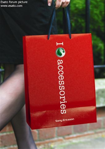
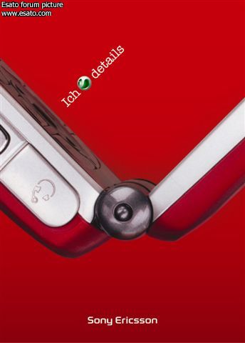
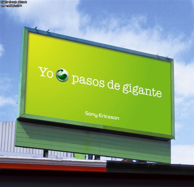
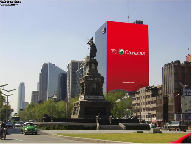
The brand identity includes a new range of vibrant colours, deliberately selected to stand out from the white, grey, black and blue tones used by most technology brands today. In addition to the new colours, there is a strong central concept comprising two key elements � a worded message and the portrayal of sentiment around the Sony Ericsson liquid identity.
The rules are simple: the message always starts with �I�, the individual, followed by the liquid identity and then a message relating to the things the individual loves, cares about or is inspired by. This framework can be applied in any number of ways, in any language, connecting with the audience visually and instantly.
Andrew Warner, Head of Brand Management for Sony Ericsson, explains how the identity is designed to connect with its audience: �As soon as you see this there is immediate engagement between you and the Sony Ericsson brand. The message is that it is treating you as an individual � it is not telling you what to think about Sony Ericsson, it is reflecting what you think. This is not just a traditional, static brand identity. We plan to increase our use of interactive media to build a dialogue with consumers around the world and effectively start co-creating our brand messages with them.�
�People want to know how our products can add to their life - how connected they can be, how much fun they can have, how much better they can work, and more. Our new brand identity relates our products to the things people care about in a very simple way. It is focused less on what�s inside the products and more on what consumers get out of them,� he concludes.
Simplicity is the underlying principle that runs through every aspect of Sony Ericsson�s business, from product design to marketing, so the new brand look will further strengthen the company�s commitment to this approach.
Adam Throup, Creative Director at Wolff Olins elaborates: �We are developing a distinctive global brand that is flexible enough to embrace local differences, speaking directly to people about what they want and what they love doing.�
Photos of the new brand identity are available from the press room section of www.sonyericsson.com
|
|
|
goldenface
Joined: Dec 17, 2003
Posts: > 500
From: Liverpool City Centre
PM |
Here are some examples. Don't worry, the original logo is still there.
_________________
T18s>>>T300>>>T610>>K700>>S700>>J5>>W900i
[ This Message was edited by: goldenface on 2006-10-02 10:07 ] |
pinolo77
Joined: Jan 17, 2002
Posts: 390
From: Lugaggia, Switzerland
PM |
I like the idea and the design. What I like less is the "I" concept... Which is just the "capital" version of the MAC "i" like iPod, iTv, iTunes and so on...
Maybe at  they don't have any macs... they don't have any macs...
Really, I think that the idea of the "I" is old already!
_________________
T18s>T68(i)>T610>K700>K750i>K800i>?
Addendum: even if the I will be translated it still looks to me as if it is too close (at least in the anglosaxon world) to the Apple style of naming devices.
[ This Message was edited by: pinolo77 on 2006-10-02 11:18 ] |
JK
Joined: Feb 24, 2005
Posts: > 500
From: S. Africa - JOZI
PM |
It looks photochopped... |
goldenface
Joined: Dec 17, 2003
Posts: > 500
From: Liverpool City Centre
PM |
Quote:
|
On 2006-10-02 12:47:48, 786KBR wrote:
It looks photochopped...
|
|
The Mexican one does. I like the new colours etc.
Didn't change advertising agencies recently. Maybe that has something to do with this new look....
|
n3o
Joined: Sep 02, 2005
Posts: 427
PM |
this pics are from SE official page |
goldenface
Joined: Dec 17, 2003
Posts: > 500
From: Liverpool City Centre
PM |
That's were I got them from.
|
dr_thug
Joined: Nov 11, 2004
Posts: > 500
From: India
PM |
those saatchi & saatchi guys might be behind this ad campaign. 
|
cristiano
Joined: Feb 15, 2006
Posts: > 500
PM |
i think they will bring for us agreat mobile
just like nokia when they opened in N.Y |
dr_thug
Joined: Nov 11, 2004
Posts: > 500
From: India
PM |
there seems to be more such print ads...
http://www.sonyericsson.com/s[....]_2_1&zone=pc&lm=pc3_2&esi=true
but they all are huge in size.why don't they make a smaller size??
i would love to see some wallpapers.
|
Vipera ammodytes
Joined: Sep 22, 2004
Posts: > 500
From: Serbia
PM |
Nice design  |
Krubach
Joined: Dec 05, 2002
Posts: > 500
From: Sunny Portugal! :)
PM |
Quote:
|
On 2006-10-02 12:16:16, pinolo77 wrote:
I like the idea and the design. What I like less is the "I" concept... Which is just the "capital" version of the MAC "i" like iPod, iTv, iTunes and so on...
Maybe at they don't have any macs...
Really, I think that the idea of the "I" is old already!
|
|
Dead wrong...
The "I" thing is to remind the "I (heart) N.Y.", etc...
So the SE logo is replacing the "Love" part of the sentence.
This way it gives a more emotional meaning to the logo by implying love.
The "I" has nothing to do with the "i" from i-Everything which is completely weared out:
"I want to sell socks. Ok... i'll just call them an iSock and connect it to the PC so it tells me when they stink." 
Just my 2 cents
_________________
 Stop looking at me. I don't like people looking at me like that. Stop looking at me. I don't like people looking at me like that.
F�rmula1 em Portugu�s: http://www.f1portugal.com
[ This Message was edited by: Krubach on 2006-10-02 14:10 ] |
goldenface
Joined: Dec 17, 2003
Posts: > 500
From: Liverpool City Centre
PM |
Quote:
|
On 2006-10-02 15:08:02, Krubach wrote:
"I want to sell socks. Ok... i'll just call them an iSock and connect it to the PC so it tells me when they stink."
Just my 2 cents
_________________
Stop looking at me. I don't like people looking at me like that.
F�rmula1 em Portugu�s: http://www.f1portugal.com
|
|
 Very good Very good
|
JAGUY85
Joined: Oct 17, 2003
Posts: > 500
From: Jamaica
PM |
I hope this is the beginning in a new era in Sony Ericsson. Now we need to see some mobiles worthy of this new vision. Look out world!
This message was posted from a 6230 |
mts
Joined: Feb 20, 2002
Posts: 126
PM, WWW
|
looks like we got some present(s). no content in this moment
 |
|
|


 Posted: 2006-10-02 10:41


