| Author |
Sony Ericsson Logo Designer |
axxxr
Joined: Mar 21, 2003
Posts: > 500
From: Londinium
PM, WWW
|
I don't think we have ever had a topic on the man that created the amazing sony ericsson  logo.Although we have had a thread SonyEricsson design team presentation & discussion So i am kean to learn more about art designer Takuya Kawagoi please post any information you may have about him. logo.Although we have had a thread SonyEricsson design team presentation & discussion So i am kean to learn more about art designer Takuya Kawagoi please post any information you may have about him.
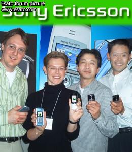
Takuya Kawagoi

Takuya Kawagoi Far Right
_________________
British to American Translator
guess the worst sin
[ This Message was edited by: axxxr on 2005-12-09 02:56 ] |
|
|
*Jojo*
Joined: Oct 15, 2003
Posts: > 500
PM |
@axxxr - I wonder if he will be given a NEW handset (as a REWARD/part of the contract) everytime a NEW model is released out in the market  [addsig]
 |
BobaFett
Joined: Jan 06, 2004
Posts: > 500
From: Kamino (wish it would be Lund)
PM, WWW
|
@axxxr
thats all i can offer u:
http://www.digitaljournal.com/print.htm?id=3685
( so this guy created the slimeball... )
|
axxxr
Joined: Mar 21, 2003
Posts: > 500
From: Londinium
PM, WWW
|
Yes boba....hes's the slimeball creator! 
Im wonder what other projects he's undertaken for companies?..he cant just have done this one logo...or what other designs hes made for
[addsig] |
Vein
Joined: Jun 18, 2005
Posts: > 500
From: Wilts, UK
PM |
I've always thought that the logo should've been some sort of combination of /// and Sony, rather than something new altogether.
I suppose the logo though, the S for Sony is represented in the silver bordering of the logo and also represents the /// strips as there are three borders/two seperations.
Vein Autostyling (+28 -0)
www.cliosport.net
www.e30zone.net |
thami
Joined: Feb 08, 2005
Posts: 169
From: UK
PM |
Some information i found using google
Although it is meant to look partially like the symbiotic amalgamation of an �S� and a lowercase �e,� the logo also represents the company�s entire design philosophy, as Kawagoi explained. It�s both futuristic and organic, designed to invoke the concepts of flexibility and fluidity. Kawagoi used morphing techniques to draft it in several stages, which is why it�s often shown as a quick animation at the end of television ads � with some extra pyrotechnics. Eventually, they may revamp the symbol to make it simpler and more inclusive so the image reflects the evolution and expansion of the company.
Takuya Kawagoi, Sony Ericsson Art Director and designer of the Sony Ericsson Logo. � Photo djc features

The Sony Ericsson logo is both futuristic and organic and designed to invoke the concepts of flexibility and fluidity. |
tranquil
Joined: Dec 15, 2001
Posts: > 500
From: Oslo, Norway
PM |
Cool!!!
I've never thought of the s and the e in being in the logo. Now that I know it's actually very clear.
Logo artists are extremly talented when it comes to squeezing a lot of "hidden" info in to a logo.
Not to change the subject of this topic but as an example; Has any of you seen the arrow in the FedEx logo?

You read from the left to the right, the arrow is in the loint up letters of E and X pointing the way you read. Ie, FedEx is bringing your parcel the right way. It's exactly the same with the logo; it says more than you see at first.
|
Sony Ericsson Indonesia
Joined: Oct 08, 2002
Posts: > 500
From: Sony Ericsson Land
PM |
haha thats so cool it took me a while to see it but yea (fedEx logo i mean)are there anymore things like that?
|
DCUK7
Joined: Aug 01, 2004
Posts: > 500
From: Liverpool, UK
PM |
I really couldn't see the arrow at first, I thought you might have been drunk but yes, very clear once you see it, amazing! |
DickySnapples
Joined: Dec 05, 2003
Posts: > 500
PM |
Quote:
|
On 2005-12-11 21:50:03, Sony Ericsson Indonesia wrote:
haha thats so cool it took me a while to see it but yea (fedEx logo i mean)are there anymore things like that?
|
|
toyotas logo spells out TOYOTA

[ This Message was edited by: Dicky Snapples on 2005-12-11 23:29 ] |
max99
Joined: Nov 24, 2004
Posts: > 500
From: Manchester (@ Uni)
PM |
wicked both are well good

Big Ten logo, which added an 11th team a few years back, thus you can see a subliminal 11 in their logo.
fink we kinda taken over point of thread, soz
_________________
Apple Store �23 off use code NA178C9CBB
Motorola v3 PINK �129.99 when bought with �20 airtime
[ This Message was edited by: max99 on 2005-12-12 09:59 ]
[ This Message was edited by: max99 on 2005-12-12 10:02 ] |
vanquish
Joined: Mar 20, 2003
Posts: > 500
From: Wor Newcastle Phone: V600i
PM, WWW
|
@max
thats a crap logo.
@all
in art, we are told that you normally get two types of logos.
The good ones, and the interesting ones.
Motorolas logo is great, but its not very interesting. but it works, because it looks great.
Sony Ericssons is brill because its interesting, but to many of my mates, just a bit complicated.
Logos do different things, and as a logo designer this site has helped me 38one.com he reviews logos and people post up logos theyve seen that they like.
I certainly LOVE the SE logo, its brilliant.
[addsig] |
ares
Joined: Dec 11, 2003
Posts: > 500
From: Coimbra, Portugal
PM |
I also find it brilliant
Quote:
| I've always thought that the logo should've been some sort of combination of /// and Sony, rather than something new altogether. |
|
SE IS something new altogether, its not Sony and its not Ericsson, so the logo is well made
SE w880 + Iphone 4 16gb |
methylated_spirit
Joined: Jul 07, 2004
Posts: > 500
From: Bonnie Scotland
PM |
The fedex one is interesting, i never noticed it before, and now i cant not notice it, it keeps catching my eye
Hello, Scroto!
U.G.L.Y. You ain't got no alibi, you ugly! |
andymac
Joined: Jul 14, 2005
Posts: 110
From: Gloucester, England
PM |
Just got the Fedex one - could not see it at first - but how many who see it and don't have the arrow pointed out actually do? Probably less than 1%? |
|
|


 Posted: 2005-12-09 03:55


